Computer Illustration II
Photoshop & Illustrator
This one is just me goofing around for this assignment, honestly. It had to be made in a style reminiscent of Russian Constructivism. I made mine slightly comical using my own picture. This one was more about learning filters and layer styles and blending options in Photoshop. I also created most of the background in Illustrator and imported it back into Photoshop to finish it up. It helps to try out new techniques each time, so over time, I can perfect them.
"A work of art is the unique result of a unique temperament". ~Oscar Wilde.
April 27, 2013
April 26, 2013
Skate Boarding Poster
Computer Illustration II
Skate Boarder Poster
Adobe Photoshop CS6
Well, it's been a little while and I've been learning new tricks in Illustrator and Photoshop.
This is a fictional store poster for a skateboard store. I used suggestions from classmates and my instructor and I am pretty pleased with it. I was still unsure about the results, but I got my grades back and seems like the teacher agreed that I did pretty good here :). I created everything on this except the skater, which was a random image on a web search.
Skate Boarder Poster
Adobe Photoshop CS6
Well, it's been a little while and I've been learning new tricks in Illustrator and Photoshop.
This is a fictional store poster for a skateboard store. I used suggestions from classmates and my instructor and I am pretty pleased with it. I was still unsure about the results, but I got my grades back and seems like the teacher agreed that I did pretty good here :). I created everything on this except the skater, which was a random image on a web search.
April 21, 2013
March 18, 2013
Figures - Acrylic Paint
Life Drawing II
Acrylic
I finally got a chance to create figure paintings. I've always wanted to try but had no idea where to begin. For this assignment, we used our sketches from earlier in the week to paint themI watched a bunch of tutorials at first about how to blend skin tones properly and which base colors to use. The one I subscribed to that I really liked the most was from an artist named Eric T. Francis. I hadn't heard of him before, but I'm really glad I found him in my search!
I have no idea why I was so apprehensive about painting. I had a ton of fun once I got into it and started to understand a little bit how to get the right tone. Not bad for a first attempt at painting a figure with acrylics! I'm pretty happy about this!! I will definitely use it more and paint some landscapes in the future.
March 16, 2013
March 15, 2013
Sketches - charcoal figures
More random sketches I did for class. I think, and my teacher agrees, that my proportions are getting better as I go along. I just need to keep at it!


March 6, 2013
Figure - Pen & Ink
Life Drawing II
Micron 0.07mm black ink pen.
I should have used a brush tip ink pen for this assignment, but was unable to find on in my area at the time I needed it. I like the turnout, but it took a looooong time to get all the hatching in place, haha!
Micron 0.07mm black ink pen.
I should have used a brush tip ink pen for this assignment, but was unable to find on in my area at the time I needed it. I like the turnout, but it took a looooong time to get all the hatching in place, haha!
March 4, 2013
Figures - Color Pencils
Life Drawing II:
3 Figure drawing in color pencils (18x24 in.)
It's really great getting back to my artistic roots. I really enjoy drawing, and this time around I found I enjoyed it a lot more than I remember. The last time I drew strictly with color pencils was my senior year in high school in early 1999, when I learned how to blend colors.
I should draw more often to improve my proportions and my line weight confidence, but it's getting there :)
1 - Monochromatic Primary (one color).
Within the limits of primary colors, I could only really do this drawing in either blue or red. I chose red because there is a lot of tension in the pose and it is not very relaxed. I think the red color picks up on that intensity very well and and allowed me a wide range of tones.
2 - Complimentary Colors (opposites on the color wheel).
This set of colors was a bit more difficult to chose. I wanted to keep a color scheme in tune with the pose once again, but I couldn't very well use blue and yellow (for obvious reasons). I ended up choosing yellow-green and red-purple. I did a lot better than I thought I would on the model's face, but there is still work to be done here too, of course. Someday I'd like to redo this drawing in an analogous blue set of colors.
3 - Analogous w/ One Primary (next to each other on the color wheel).
I chose blue, purple, and red-purple for this final drawing. It took a little more time to complete because I constantly went over the tone with the different colors to make sure they were all visible. I think I will do without the figure's outline next time, or at least in a much more subtle tone. In fact, it may work better with a different set of analogous colors all together... I'll try this again too someday
3 Figure drawing in color pencils (18x24 in.)
It's really great getting back to my artistic roots. I really enjoy drawing, and this time around I found I enjoyed it a lot more than I remember. The last time I drew strictly with color pencils was my senior year in high school in early 1999, when I learned how to blend colors.
I should draw more often to improve my proportions and my line weight confidence, but it's getting there :)
1 - Monochromatic Primary (one color).
Within the limits of primary colors, I could only really do this drawing in either blue or red. I chose red because there is a lot of tension in the pose and it is not very relaxed. I think the red color picks up on that intensity very well and and allowed me a wide range of tones.
2 - Complimentary Colors (opposites on the color wheel).
This set of colors was a bit more difficult to chose. I wanted to keep a color scheme in tune with the pose once again, but I couldn't very well use blue and yellow (for obvious reasons). I ended up choosing yellow-green and red-purple. I did a lot better than I thought I would on the model's face, but there is still work to be done here too, of course. Someday I'd like to redo this drawing in an analogous blue set of colors.
3 - Analogous w/ One Primary (next to each other on the color wheel).
I chose blue, purple, and red-purple for this final drawing. It took a little more time to complete because I constantly went over the tone with the different colors to make sure they were all visible. I think I will do without the figure's outline next time, or at least in a much more subtle tone. In fact, it may work better with a different set of analogous colors all together... I'll try this again too someday
February 24, 2013
February 10, 2013
December 10, 2012
McLaren 2012
Illustration I - Drawing from an Image, part II.
Original Image: Article in The Columbus Dispatch
Auto Review: Supercars |Three supercars deliver fun at 200-plus mph
For the final for this class, we combined everything we learned about drawing with Illustrator, using the pen tool especially, and adding the gradient and mesh tools for 3-D effect. Also, using global colors (which I may have forgotten to do throughout, but used most).
I had a lot more fun with this one and it took less time than The Potted Plant because I had a better idea of what I was doing. The toughest was knowing where to start, and whether to draw the car in segments or draw the whole outline and add the detail. I opted for the latter and I don't know whether it made a difference in the end, but I am very happy with the result.
I was showing my husband (a super-car mega fan) my progress and at first, he was just nodding and saying "nice"; when I started adding details and mesh for the shine effect, he had a big smile on his face and the "nice" became "NIIIIIIIIICE!" haha :). It's great to have a fan club. Hope you guys like it too!
Here is the final product :)
Original Image: Article in The Columbus Dispatch
Auto Review: Supercars |Three supercars deliver fun at 200-plus mph
For the final for this class, we combined everything we learned about drawing with Illustrator, using the pen tool especially, and adding the gradient and mesh tools for 3-D effect. Also, using global colors (which I may have forgotten to do throughout, but used most).
I had a lot more fun with this one and it took less time than The Potted Plant because I had a better idea of what I was doing. The toughest was knowing where to start, and whether to draw the car in segments or draw the whole outline and add the detail. I opted for the latter and I don't know whether it made a difference in the end, but I am very happy with the result.
I was showing my husband (a super-car mega fan) my progress and at first, he was just nodding and saying "nice"; when I started adding details and mesh for the shine effect, he had a big smile on his face and the "nice" became "NIIIIIIIIICE!" haha :). It's great to have a fan club. Hope you guys like it too!
Here is the final product :)
The Potted Plant
Illustrator I - Drawing from an image
This one was difficult at first because I was (am) still learning about the pen tool on Illustrator. I had to use only that tool for the entire image, which is not as easy as it looks when you have never used it ;p. Once I got the hang of it though, it went pretty smoothly toward the end. I found the image of a potted plant online.
I'm pretty stoked about what more I can do with this skill =)

This one was difficult at first because I was (am) still learning about the pen tool on Illustrator. I had to use only that tool for the entire image, which is not as easy as it looks when you have never used it ;p. Once I got the hang of it though, it went pretty smoothly toward the end. I found the image of a potted plant online.
I'm pretty stoked about what more I can do with this skill =)

November 17, 2012
One Point Perspective
I've used Illustrator before to draw and it's not easy but I'm sloooowly getting better at it, haha! This assignment required us to only use basic shapes and try to create depth using one-point perspective. I am still learning how to use each tool separately, so I have ways to go yet.
I think after I've learned and mastered them, I will probably try to draw this again and do a "before & after" to see my progress. This class definitely taught me patience and was very good for practice :)
November 13, 2012
Figure Charcoal
This is a drawing from a life drawing class, working on shades and shadows. It was a very quick one, and I have the most fun with these because charcoal is my favorite medium :)
November 11, 2012
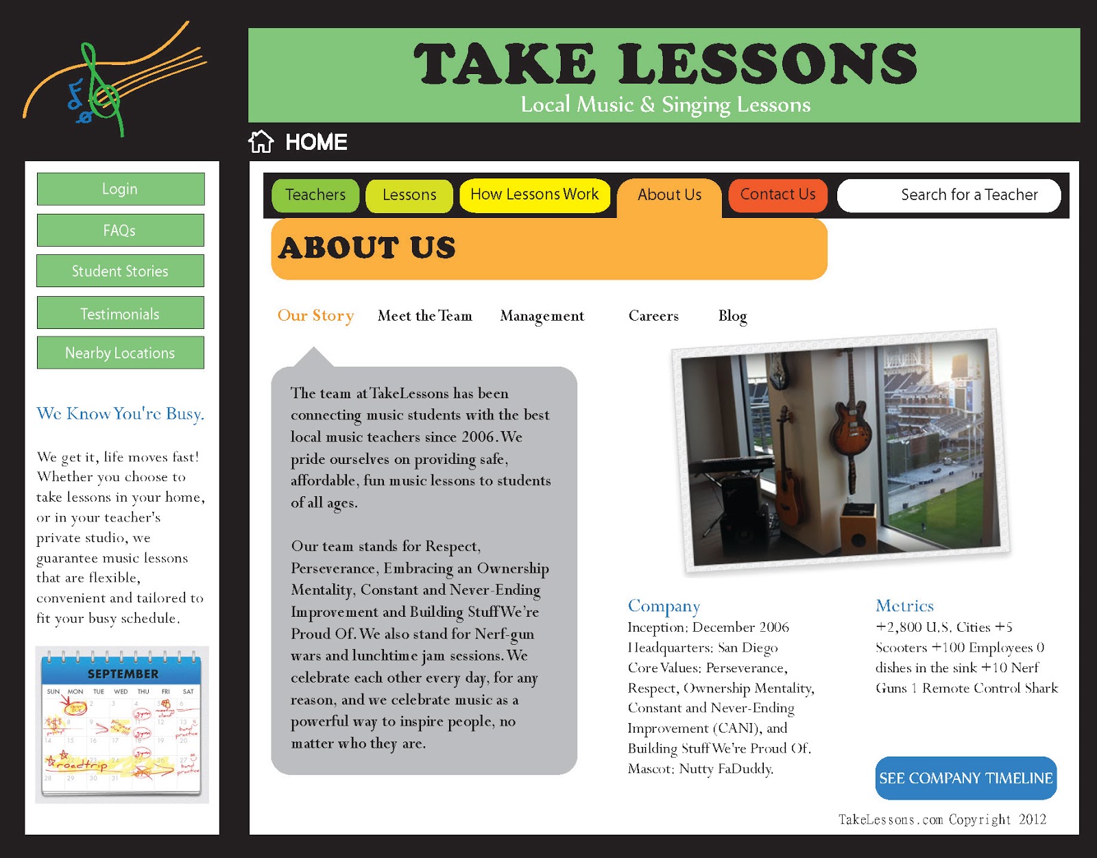
Music Lessons
Course:
Web Design I
Project:
Redesign 7 pages from a website that relates to music.
Original Website: Tampa Music Lessons
For this project, I chose to drastically change the color scheme of the site starting with its background. I wanted the colors to jump at the viewer and pop, because that is the effect music has on me. It has impact. I used Illustrator to create a basic layout for the site, that would help the navigation.
What I found that caused some difficulty on the original website was that the homepage was very long, and you had to scroll for a long time to find more information. I condensed everything into a one page view with several links, using brighter colors for easier navigation. I added a left vertical navigation for secondary information. It does not show in these images, but the hierarchy includes three levels at the most. This assignment may even be my one and only attempt at web design because writing code is not for me!! Haha :) Still, I did what I could.
Let me know what you think!
October 29, 2012
Company Branding
This was a really fun assignment that took about 5 weeks to complete for a Business class. Using our future business, we had to create a brand with company logo, letterhead, invoice, promotional calendar, brochure, post card and thank you cards. The last two are pretty similar, but it was my first crack at it. I used Microsoft Publisher for each document and designed my company logo (Kamuanya Designs) in Illustrator and InDesign.
It was a great experience that gave me great feedback from my classmates and instructor as well, and I hope I'll get more from you all.
September 24, 2012
Logo Design
I created two logo samples for an imaginary company called Thermoline. Their product is a clothing liner that serves to insulate the body from heat in the summer and cold in the winter. It is light, airy and reusable. I used Adobe Illustrator for the design of the typeface for both options.
This third one is the final image I submitted for a grade after suggestions and comments from the instructor and classmates :)
September 23, 2012
Creative Ideas Magazine (Final)
Project completed for the mini-magazine I created for Graphic Design I.
I like how it turned out because it took more shape and I was able to get a little more depth. I found ways to turn the pages into a unit by using repetitive elements in the footer, the colors, and a lot of the typeface. Thanks to all the bright minds in my group and my class for their suggestions, I made some edits to the previous work (artistry spread).
I could still use more feedback to improve, so don't hesitate to let me know what you think :)
I like how it turned out because it took more shape and I was able to get a little more depth. I found ways to turn the pages into a unit by using repetitive elements in the footer, the colors, and a lot of the typeface. Thanks to all the bright minds in my group and my class for their suggestions, I made some edits to the previous work (artistry spread).
I could still use more feedback to improve, so don't hesitate to let me know what you think :)
September 6, 2012
Artistry Article
This is a two-page spread assignment for Graphic Design I in continuation to the magazine cover assignment for Creative Ideas.
I found a really great image on Best Wallpaper's website and used it as the background for my article. Then, I found an article on Harper's Bazaar website about hair trends and used that as filler. Everything except for the word "Artistry" and the footer comes from that HB article online (which I referenced when I turned in my assignment).
I really love this and I'm really glad I got another assignment where I could create a spread. It's a lot of fun once you know what to look for. The one part I am not so sure was successful, was the text color. I couldn't use black on the far left column because it would have been really hard to read. I am not sure if it works well enough with the change in colors, but the assignment was in fact about using contrast and elements that would impact the viewer. I also played with contrast when I created the footer with the page numbers, article name, edition date etc. On the right page, I split the typeface's colors to contrast against the woman's skin.
I think it works but let me know what you think :)
I found a really great image on Best Wallpaper's website and used it as the background for my article. Then, I found an article on Harper's Bazaar website about hair trends and used that as filler. Everything except for the word "Artistry" and the footer comes from that HB article online (which I referenced when I turned in my assignment).
I really love this and I'm really glad I got another assignment where I could create a spread. It's a lot of fun once you know what to look for. The one part I am not so sure was successful, was the text color. I couldn't use black on the far left column because it would have been really hard to read. I am not sure if it works well enough with the change in colors, but the assignment was in fact about using contrast and elements that would impact the viewer. I also played with contrast when I created the footer with the page numbers, article name, edition date etc. On the right page, I split the typeface's colors to contrast against the woman's skin.
I think it works but let me know what you think :)
Subscribe to:
Posts (Atom)


.jpg)